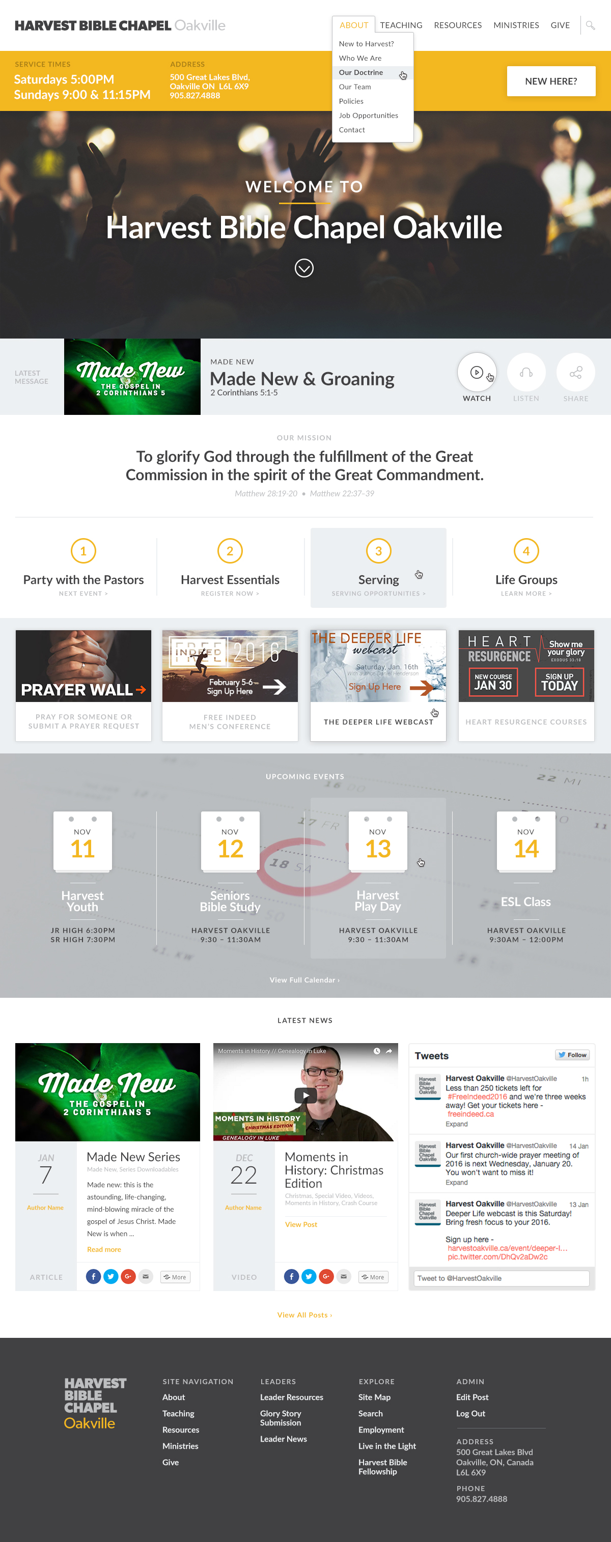
Harvest Bible Chapel OakvilleIn Progress
Purpose of ProjectRedesign of the Harvest Oakville homepage.
At Harvest, I had the pleasure of being able to rethink the face of the organization online. It's current homepage was never originally meant to last as long as it did as we were looking to launch fast and needed something to start with.
As it's now been almost a year since relaunching with the new look, we are back to the drawing board with the homepage to see if we can make it a little more pleasant to use.
We wanted to have a more visually appealing front page with more imagery relating to the life of the church.
Currently we have a mix of font sizes and faces with little to no coherence. This new design brings order and heirarchy to the typography on the page. This helps to make a more pleasant and readable experience.
